
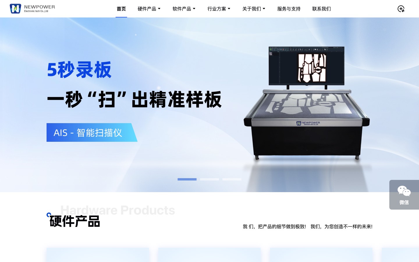
Start with a desktop and mobile experience that did not work together
At the start of the project, the PC and mobile browsing experience had not been handled well. For an industrial company with many products and solutions, that limited office research, quick phone access, and face-to-face customer conversations.
Bring the same content to different devices
The delivery adapted the site for desktop, phone, and tablet so customers could reach the same product and solution content without maintaining disconnected explanations for each device.
- Desktop kept the full product, software, industry solution, and support entry points.
- Mobile kept important content usable on a narrower screen.
- The iPad adaptation brought the pages into face-to-face presentation situations.
Take the website into a trade show
After the iPad adaptation, the sales team could use an iPad at trade shows to present products and solutions to customers. The value is bringing existing information into a real sales setting, not inventing a deal count or conversion-rate result.
How this relates to GEO and SEO
Important information that remains accessible, readable, and navigable across desktop, phone, and tablet is part of a sound foundation for search engines and AI systems. Responsive delivery is not evidence of ranking, AI citation, enquiry, or sales growth; this case demonstrates experience and delivery capability.
Use it if your B2B company has many products and solutions and sales needs to move between office screens, mobile browsing, and tablet presentations at exhibitions. Ranking, traffic, or sales claims would require a separate measurement window and attribution evidence.